For lists, there’s a lot of information that you can provide, but there’s one that we often don’t use. Color. It’s handy to have the extra dimension of information in cases like, when you have a task list and date is due or when a cell has incorrect data.
Using the right color and rules will greatly increase your apps’ usability. We’ll define use cases:
- Dates, where we’ll check If the date has elapsed or not
- Status to highlight the step of the process.
- Ranges where we’ll check if a number is within a specific range.
Some things to think about
Before we go further there are some caveats that I would like to highlight:
- Always take into consideration culture. Colors mean different things to different cultures, so be aware of that. An example is red in China is associated with wealth and stock gains, so the stock market is red when it goes up and green when it goes down.
- Be always sensitive with people with visual impairments. For example, some people are color blind, so that that color representation won’t help them. Also, keep in mind best practices like high contrast colors and other elements to better understand the content.
- Please don’t push it. Using too many colors will make your app look like a slot machine. Use them with care.
The test app
We’ll use me “How to create an app with SharePoint in 2 minutes” article for the use cases. It’s not clickbait. I timed it for you, so give it a try to have a base to start testing the concepts in this article. Here’s our starting point.
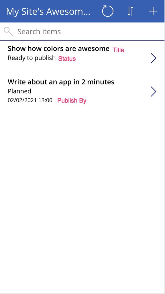
Not very interesting (yet), so let’s make it better.
First, let’s change the first item to “Published” and the second one to the date this article will be published. I’m writing it the day before so that you know the difference in dates. Also, let’s hide dates for the articles that are already published. To do this, go to “Advanced” and select “Visible.” The formula is as follows:
ThisItem.Status.Value <> "Published"
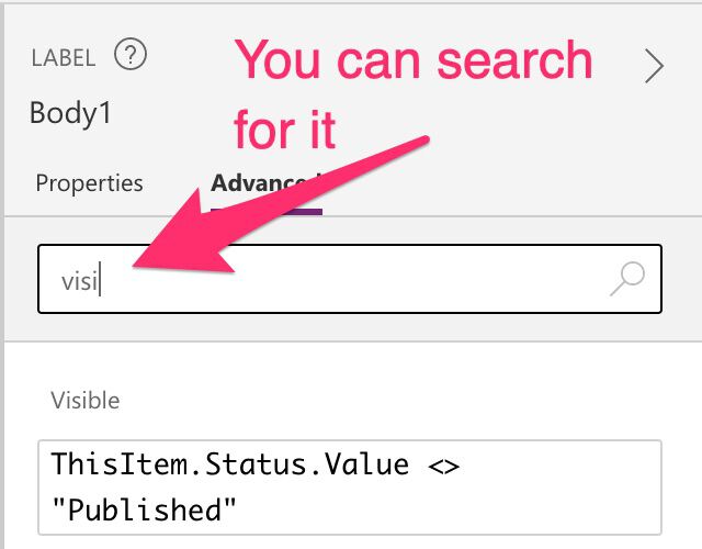
If the current item has the status value different than published, the formula will return true, so the value for “Visible” will be “true.”
Finally, let’s format the label to be more descriptive.
If(IsEmpty(ThisItem.'Publish by'), DateDiff(Now(),ThisItem.'Publish by',Days),"") & " day(s) to go"
You put this in the “Text” field, and you’re displaying the difference in days from today until the “Publish By” date. To make it look nicer, we’ll add “day(s) to do” so it looks like this:
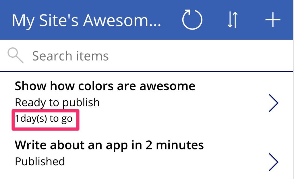
Now we’re ready to start with our use cases. We’ll add a few more results so that we have more test cases to look at.
Use Case: Dates
Let’s start with dates. Dates are often hard to read and, although we have a “friendly” mode, dates vary a lot from a region or culture. When you have a list of items with dates, it’s hard to see what are the ones that are close to the end or not. With simple color-coding, you can define metrics that will help you, in a glance, see what’s the status.
In the example above, we can do 2 things to improve the date part:
- We can change the format to make it the days until publish. Then we don’t need to do the “math” in our head.
- We’ll define 3 states:
- Green if we have more than 3 days to go
- Yellow from 3 days until the deadline
- Red if has passed the deadline.
To do this, we only need to create a formula in the “Color” property. You can find it in the “Advanced” tab.

We define the color we want the field to have. Part of the formula is the one we used to format the text above. So we need the following formula:
If(IsEmpty(ThisItem.'Publish by'), RGBA(0, 0, 0, 1) , If((DateDiff(Now(),ThisItem.'Publish by',Days)>=0 && DateDiff(Now(),ThisItem.'Publish by',Days)<2),RGBA(247, 181, 56, 1),DateDiff(Now(),ThisItem.'Publish by',Days)<0,RGBA(255, 107, 107, 1),RGBA(0, 0, 0, 1)))
We get the following.
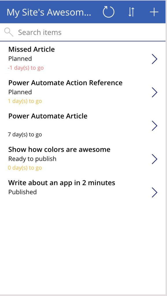
I picked the colors online and converted them here.
So we have 3 cases here:
- Red jumps out as something we missed. An article that was not published.
- Yellow are things that we need to look at soon. In this case, a deadline is approaching.
- Everything else keeps the same color since there’s no action needed.
The formula looks complex but let’s add some indentation, so it’s easier to understand.
If(
    IsEmpty(ThisItem.'Publish by'),
        RGBA(0, 0, 0, 1) ,
        If(
            (DateDiff(Now(),ThisItem.'Publish by',Days)>=0 && DateDiff(Now(),ThisItem.'Publish by',Days)<2),
                RGBA(247, 181, 56, 1),
            DateDiff(Now(),ThisItem.'Publish by',Days)<0,
            RGBA(255, 107, 107, 1),
            RGBA(0, 0, 0, 1)
        )
)
Try to make formulas that you can read out loud, like:
This is an excellent way for you to detect a “bad smell” in the formula. If you can’t read it out loud, it means that something may not be 100% correct, and you should review it or test it further.
Use Case: Status
Another use case is when you have a status for something. For example, if you have a site and have a list of posts. You can define each post’s status where yellow is “scheduled,” and green is “published,” for example. The idea is always the same. To have a Birdseye view of the information and augment it with colors.
In the case of the status, we’ll define only the published as green. All the others, we won’t do anything so as not to have too many colors.
To change the color, we apply the same concept as before. We create a formula with the color and put it in the “Color” field:
If(ThisItem.Status.Value = "Published", RGBA(144, 190, 109,1), RGBA(0,0,0,1))
We get the following:
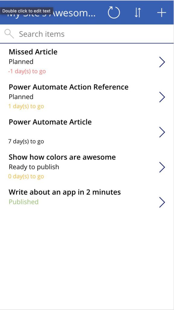
Let’s “read” the formula as before:
If(
    ThisItem.Status.Value = "Published",
    RGBA(144, 190, 109,1),
    RGBA(0,0,0,1)
)
“If the value of the status for this item is published, we color it green otherwise;, we keep the color as black.”
In this case, we want to see the ones that are finalized. We can put a filter that hides the published ones, but let’s keep it like this for the moment.
Use Case: Ranges
Finally, let’s look at ranges. Let’s say that you have an app where you store your blood test results. In these, your results should be in a range. Lower than X or higher than Y, there’s a problem. Otherwise, things are fine. Suppose you have a list where one result pops up, then it’s visible right away. In this case, the color highlights something that you should look at with more care. The other results are still helpful to look at, but this way, you focus on the important one first.
In the first use case, we defined a range. If the days that we have left are between 0 and 2, then we define a color. I did it in the same step to show you that you can combine concepts in the same formula.
Final thoughts
Like I mentioned before, color can be tricky. Be aware of this and be sensitive to other cultures and difficulties. Use the colors wisely but use them. They are super useful and provide you with a lot more information.
Photo by Aashish R Gautam on Unsplash


