I showed you in a previous article how to color-code your columns in SharePoint lists. It’s a night and day difference when your lists can display warnings, sections, and other segmentation with colors. But sometimes, the default column formatting features in SharePoint are not enough. We need more control, but to do that, let’s go a little bit into the weeds.
Our example
Let’s build upon the latest article, but for that, let’s add a new column with the due date.

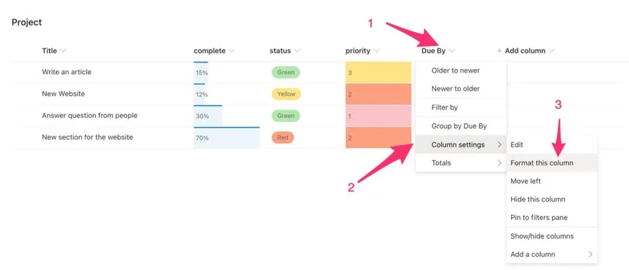
We want to display the date in red when the date has passed, and the complete is not 100%. The example combines the data in multiple columns to format one of them and change if the data changes. To do that, we need to go to “Column Settings” and then pick “Format this column.”

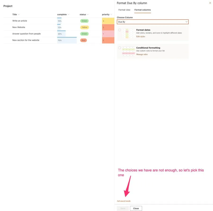
Advanced mode
Let’s open the “advanced mode.”

We’re presented with a “scary” text box with not a lot to go on. Microsoft has a reference for this that shows you some good examples of doing some cool formatting, like adding icons, changing colors, etc. You can find it in the “Learn More” link.
I’ll show you the JSON first, and then we’ll explore together each part and what makes it work:
{
    "$schema": "https://developer.microsoft.com/json-schemas/sp/v2/column-formatting.schema.json",
    "elmType": "div",
    "txtContent": "@currentField",
    "style": {
        "color": "=if([$DueBy] <= @now && [$complete] != 1, '#ff0000', '')"
    }
}
Let’s start first with the “configuration part” of the JSON and then move to the most interesting part for us.
Schema
There is a pre-defined structure so that SharePoint knows how to parse the information. A schema validates this, and you can think of it as a set of rules that your file needs to follow.
"$schema": "https://developer.microsoft.com/json-schemas/sp/v2/column-formatting.schema.json"
In our case, we’re going to define the URL for that schema that Microsoft defines. The only thing we need to do is provide the URL.
Element Type
The element type is where you’ll put your “style.” Since we’re using a style reference, the element that we’ll use is a div that contains all the formatting.
"elmType": "div"
Think of it as a container with some HTML code inside it and defines the style of that content.
Content
Here we’ll define the content that we want to display. You can display the content “as is,” or you can modify it by adding information, formatting it in another way (for example, dates), and other customization.
"txtContent": "@currentField"
We’ll leave it “as is” for this one.
Style
Now we’re going into the most interesting part—the styling of the data and where we can do the column formatting.
"style": {
        "color": "=if([$DueBy] <= @now && [$complete] != 1, '#ff0000', '')"
}
It’s encompassed in the “style,” where we can define a lot of information. This style will translate into a CSS Style, but here we can add conditions and other cool stuff to make our UI change based on the data. The structure is always the same:
"style": {
        "element": "content",
		....
}
Going back to our initial proposal, we want dates that are overdue and are not finalized. To do that, we need to check if (the condition that you see) the due date (the [$DueBy]) is less than the current date (the @now) and (the &&) the complete (the [$complete]) is not 100% (the “1” since the percentage is defined from 0 to 1). We need to color it red (the #ff0000 being the RGB code for red); otherwise, do nothing.
As you can see with the example above, you can write the expression as you think. You need to know how the syntax of the fields.
- Columns will be represented by
[$columnName] - The
@noware special variables that contain changing information, like the current date - The color you can get from sites like flatcolors.net that have amazing-looking colors. You can click the color, and the code is copied.
Final Result
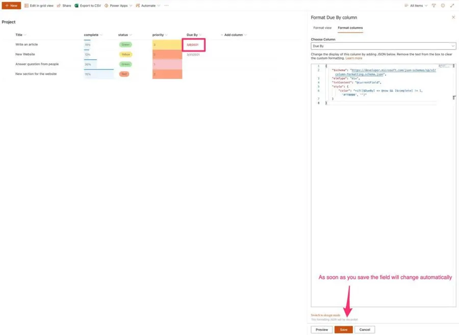
Let’s add the JSON and see the result:

The field changes automatically when you press “Preview” or “Save.”
Now let’s change the task to 100%.

Looks good!!
Final thoughts
Microsoft’s reference already provides some examples of how to format the data that you can explore. Things like adding icons, changing the background color, and many more.
Column formatting can look intimidating, but I wanted to show you the hard part. To understand the structure and how things are connected. With this know-how, you’ll be able to explore and put together the pieces to make your data look amazing!
Photo by Robert Katzki on Unsplash


No comments yet
Be the first to share your thoughts on this article!