I already wrote some articles on SharePoint but none on customization. This week I’ll talk about color-code your columns. Since SharePoint is aware of types of data like choices, percentages, etc., it can be relatively easy to provide customization that will enable people, at a glance, to know if something is ok or not.
It’s more comfortable with an example
Let’s things about a SharePoint list that contains all your projects. You want to know:
Project name
Project % completed
Status (green, red, yellow)
Priority (1-5 where lower is better)
It’s simple, but it gets the job done for most cases. The first column is the name of the project, so no customization is necessary, but what about if:
The project completion would fill the cell more or less, depending on the % completed. 100% equals a finished project.
Status with the colors and not only the text
Have a scale of colors from 1 to 5 to identify the importance of the project.
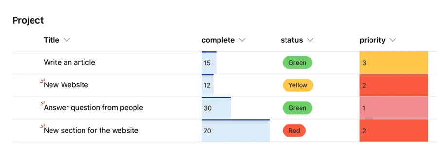
Then, when you open the list, you would see, at a glance, all the status of the project with help from the color-code of your columns.
Let’s build the list first
Making the list is quite simple. Here’s how to create each field
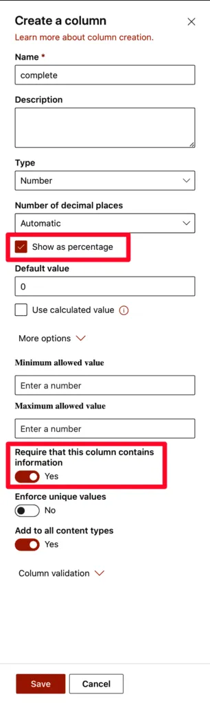
Percentage
Create a number field and tick the percentage field.
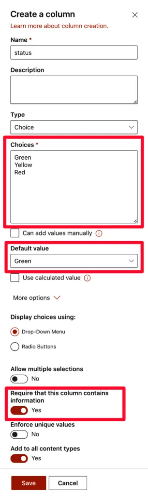
Status
The status is a choice column with the three choices selected. Since it’s a status, we won’t allow for multiple selections, but we will define a default value so that all projects start as green.
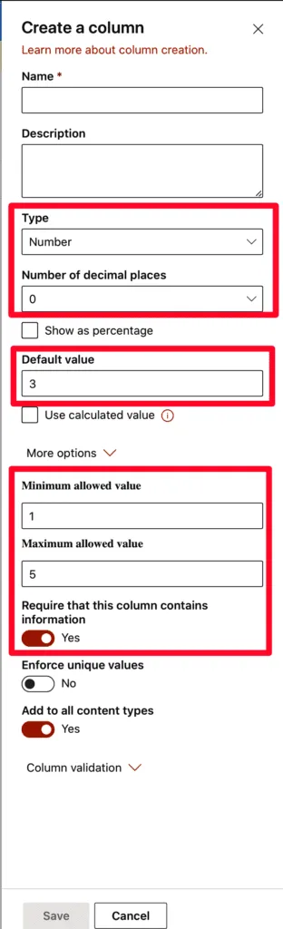
Priority
Finally, let’s build the priority. It’s a simple number field that is limited to 1 until five and has the default value 3 being the middle or average priority.
Let’s configure them.
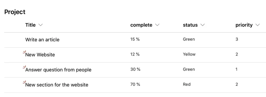
First, let’s look at the data without any configuration.
It’s a simple list. Nothing wrong with that, but we can do better.
Complete
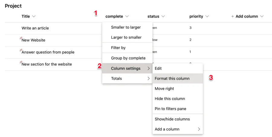
For the complete, let’s add the percentage increase. It’s straightforward:
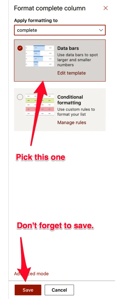
Then pick the option:
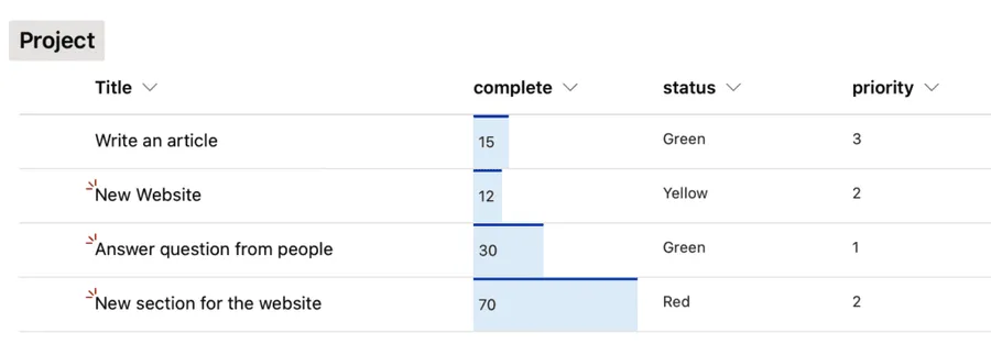
And you’re done. Here’s what it looks like:
The list is looking a lot better. Let’s continue.
Status
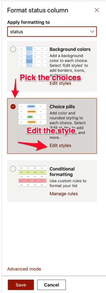
For the status, we want the columns to be color-coded. Here’s how to do it. Same steps as before, but in this case, we have to do some editing. You’ll see why on the next screen.
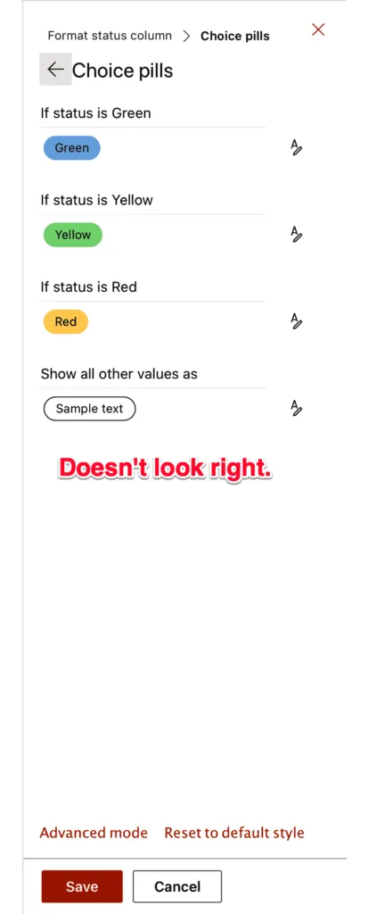
SharePoint picks the colors randomly, so they don’t look right in this context. Let's customize them:
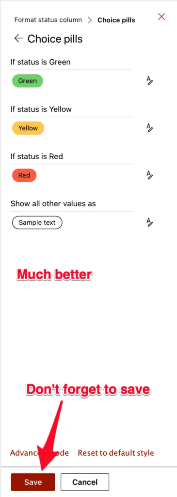
Pick the right color and repeat it for each one.
Don’t forget to save.
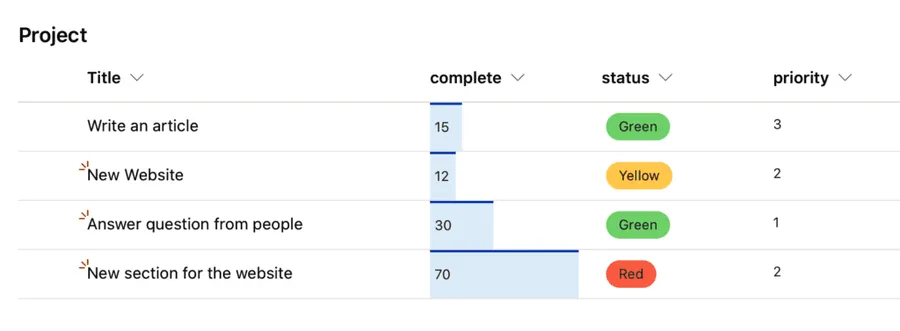
Looks a lot better, but we’re missing the priority.
Priority
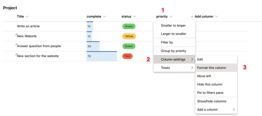
Same steps as before
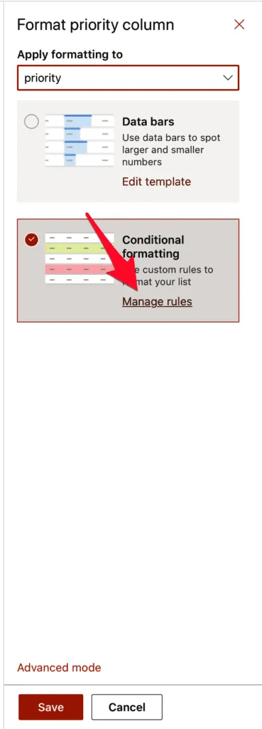
Now let’s pick the conditional formatting, and we need to edit to get the right colors.
Let’s pick a range of colors from 1 to 5. I left this example to last because it's the most cumbersome. You need to define rules for each formatting. It applies to many more cases, including if you’re formatting text or other fields.
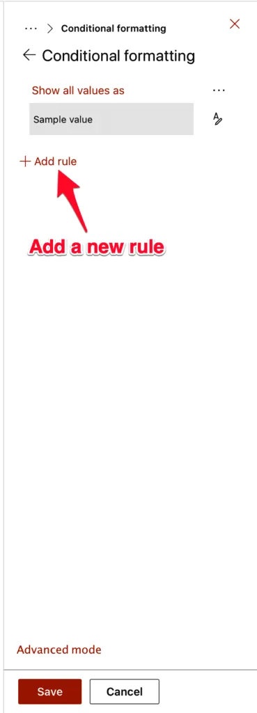
First, let’s define a rule. A rule can be a formula of any type, but in our case, we have only to determine the value equals to something. Add a new rule.
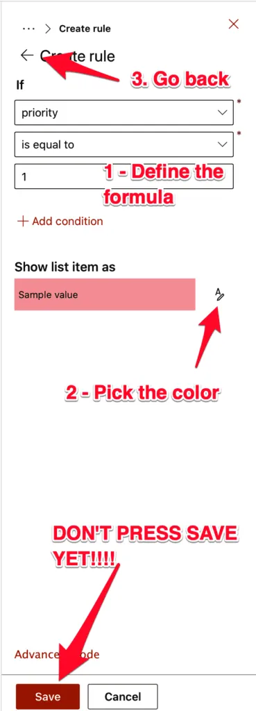
Then pick the number and the color.
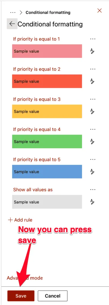
Go back and repeat for all other numbers until you get an excellent color scheme that makes you comfortable.
Now you can press save and see the final result.
Final thoughts
As you saw, with simple formatting rules and pre-defined actions, you can do quite advanced UI for your users, making their life much more comfortable.
Have a suggestion of your own, or disagree with something I said? Leave a comment or interact on Twitter and be sure to check out other SharePoint-related articles here.





No comments yet
Be the first to share your thoughts on this article!