We’ve touched a little bit on this in the topic of my last posts as the notion that you can display the information that you have in multiple and different types of views. It will enable you to have much more flexibility in how the same data gets propagated to the users. In this post, I want to go a little bit further and deeper into how you can achieve that. We are used to having a Standard View, since it’s the default view created in SharePoint, with the data presented in a table view with columns and rows, but this visualization can be quite limiting.
Also, I’m not talking about changing the theme or creating list views with more or fewer fields. It may be a topic for another time, but for now, let’s focus on the Views that SharePoint provides us.
The issues
Having a list of values can be useful if you’re using a few columns and rows, but once the data starts to pile up, the information becomes quite tricky to handle. SharePoint helps a lot by allowing you to filter and group information, remove columns, and even provide advanced features for you to organize your data, but it’s not enough. For specialized cases, we need more.
Sample List
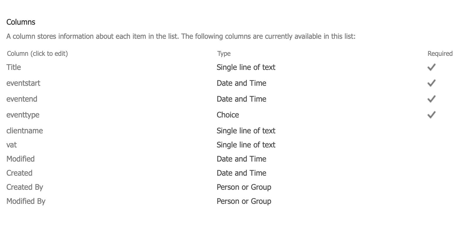
Let’s use the same sample list as before. We have a Title, Event Start, Event End, Client Name, and VAT. It will allow us to book a client for a specific event on a particular day.
Now let’s imagine three types of users that use this list:
- Operation people where they insert and manage the data
- Unit Management controls the evens and makes sure everything is ready at the time of the event.
- Global Management that wants to get an overall view of the data and analyse what units are performing the best and parse the data in bulk.
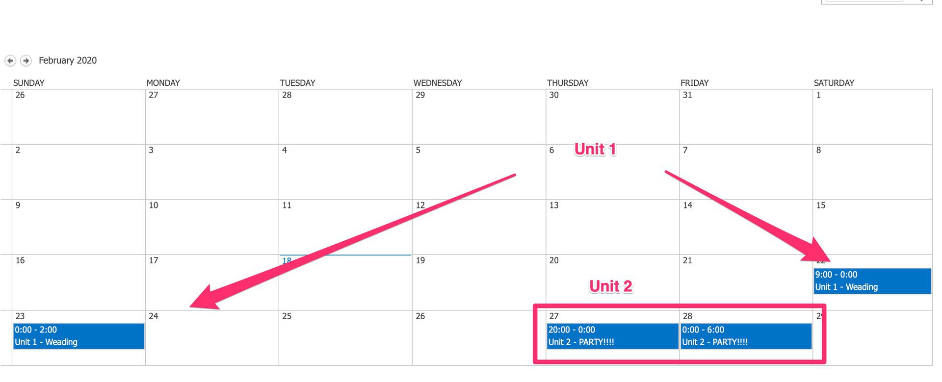
For these first and second users, we can display the information as a calendar, becoming much more natural to insert, view, and parse the evens. It can even serve as a micro CRM where you can store the information of the customer. As for the second and third users, we can also display the data in a Gantt View, where events are staked together and get a high-level representation of the data. All of this working on the same dataset.
How does it all work?
Like I mentioned before, I touched a little in a post where I show you how to create a calendar view. Before you do it, you should be aware that each view has requirements so that it’s possible to create it. If your view doesn’t contain any date fields, it would be impossible to create a calendar entry, for example. So be sure that you have the necessary mandatory fields to be able to create a view.
One crucial point is that the you map the columns with necessary fields so you don’t have to have the same names as the required fields. For example, if you have a column called “Event Start Date,” you can map it to the “Start Date” in the Gantt or Calendar view, and SharePoint will do the translation for you.
Gantt View
To build a Gantt view, you need the following fields:
- Name of the view
- Title
- Start Date
- Due Date
- Percent Column (Optional)
- Predecessors (Optional)
The first ones are quite self-explanatory, but I want to explain a little bit further the last 2. The present column will enable the view do display the progression of the task from the start until the due date. It’s especially useful if you want to check if you’re late in any specific task since it will show you the correct day and where you should be, percentage-wise, on that date.
Predecessors represent fields that depend on each other. It’s especially useful when you have sequential tasks that need one to be finalized for the other to start. The Gantt Chart will display you these dependencies in a Graphical form and will show you the project’s full overview.
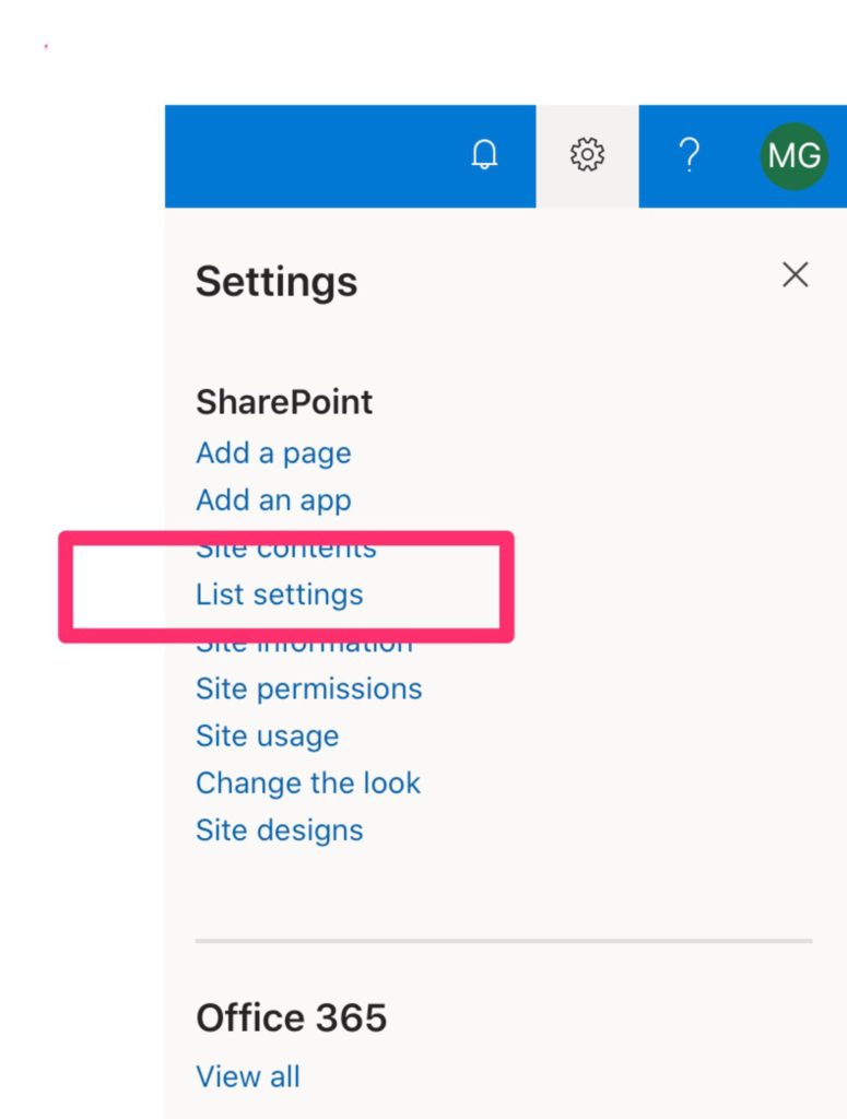
To do this we need to go to “List Settings”:
In the end we find an Area to create new views. Let’s create a new one.

And we want a calendar so let’s pick that one:

Then match the columns with the mandatory fields:

In our case, we don’t have the completion or the predecessors yet, so we’ll ignore them for now.
When you press create you’ll get this:
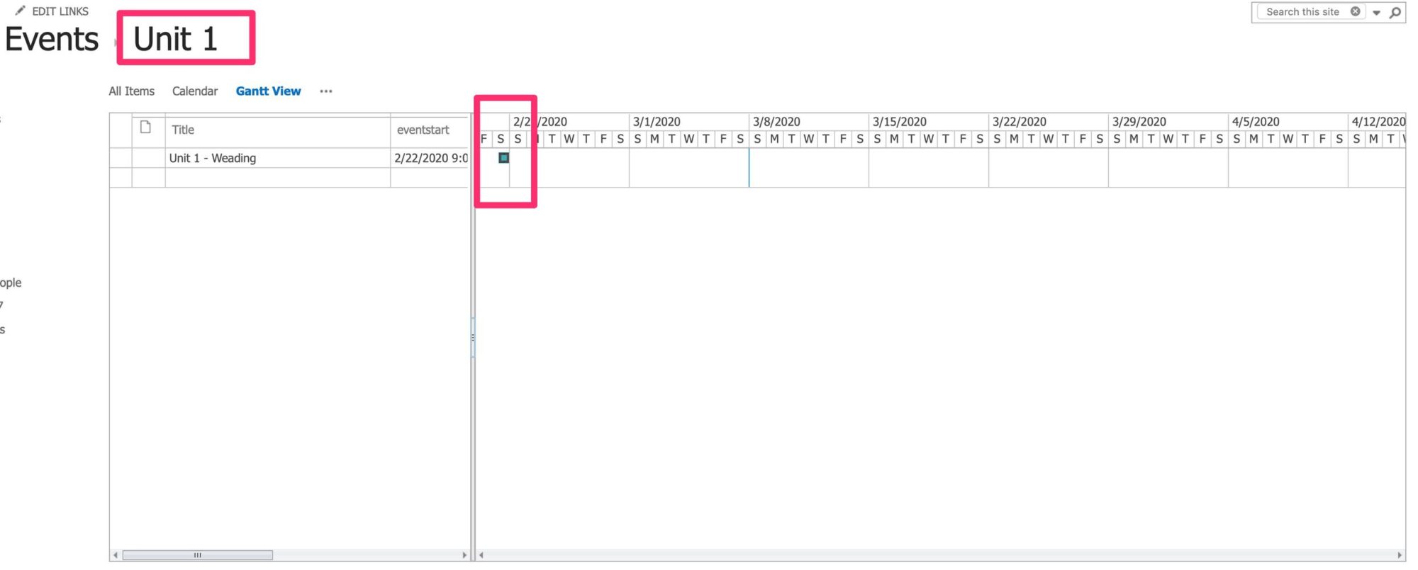
You can have a view of events that happen one day (like above) or multiple events that occur sequentially like, for example, finding a catering company, then set up the stuff for the wedding and then the actual wedding, payment deadlines, etc. All of that in one view.
Calendar View
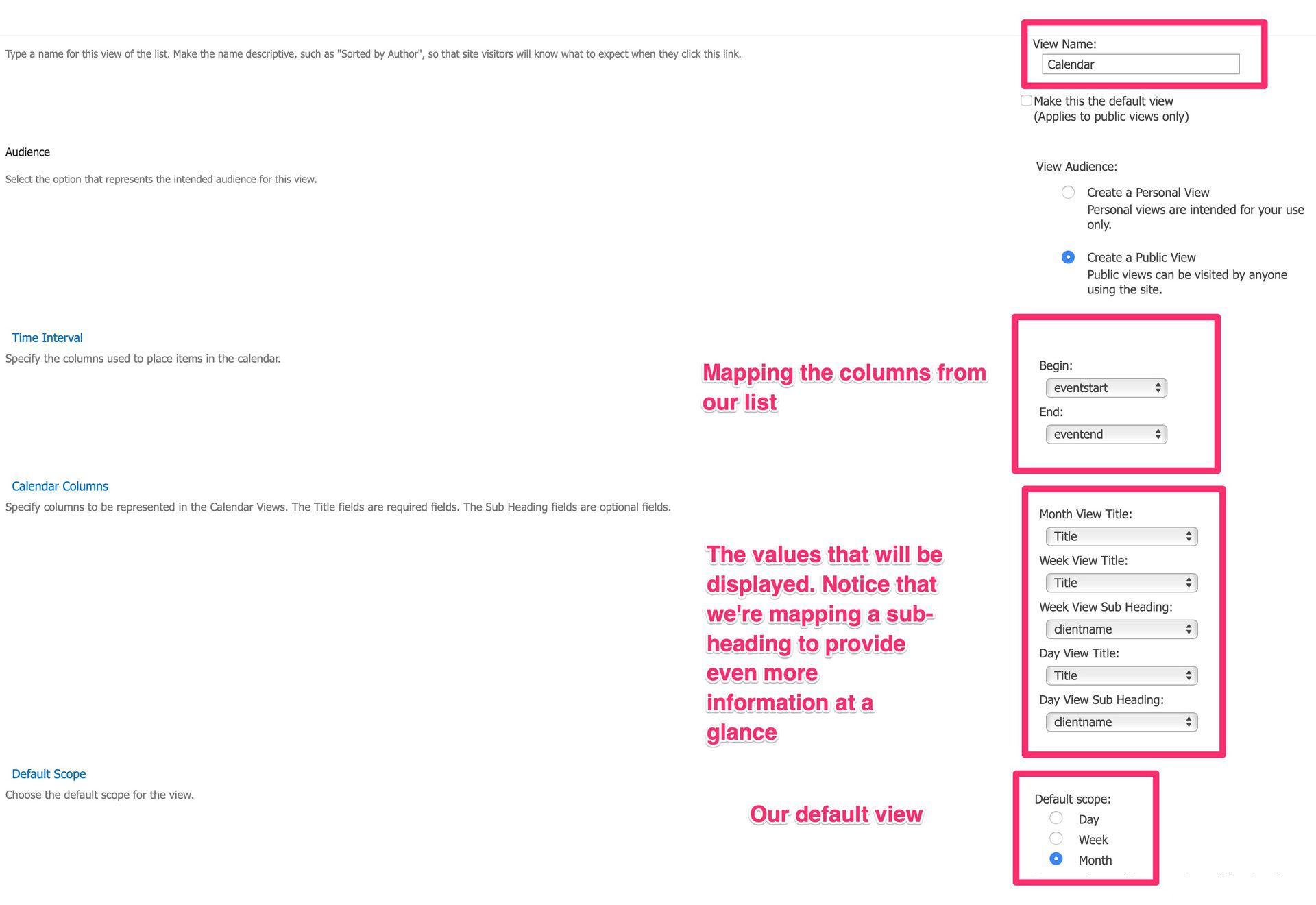
This view is quite useful to have a helicopter view of events. It requires the following fields to be present in your list so that you can map them:
- Begin
- End
- Month View Title
- Week View Title
- Week View Sub Heading
- Day View Title
- Day View Sub Heading
As always, we need to go to “List Settings”:

In the end, we find an Area to create new views. Let’s create a new one.

And we want a calendar so let’s pick that one:

Then match the columns with the mandatory fields:
When you press create you’ll get this:
Datasheet View
The datasheet view enables editing straight on the screen. This view doesn’t have any column requirements since it displays the data as the Standard View but allows editing of the fields. The way you build one is the same as above, so no need to repeat steps. In my opinion, this is less useful, but I wanted to mention it nevertheless.
Final Thoughts
Having multiple different views to show the same data helps a lot in propagating the right information to the right people so that they can easily understand it and use it more efficiently.
Have a suggestion of your own or disagree with something I said? Leave a comment or interact on Twitter and be sure to check out my other SharePoint articles.
Photo by Steve Johnson on Unsplash


Hello. Your website is helpful to me.
Thank you very much!
and may I ask you about sharepoint list , can I manage view by hierachy?
Hi Anastaiia,
Thanks a lot. I’m happy that I can help!
I recommend grouping based on columns.
Tell you what. Give me a couple of days, and I’ll write an article explaining how to do it. Sounds good?
Cheers
Manuel