
When you and your team have multiple tasks, it can be hard to keep up with what's important or not. Worse, if you don't have a graphical view of the tasks with things like charts, you would have a tough time organizing tasks, especially if they grow daily. That's why it is so important that you:
- Assign tasks to people.
- Assign due dates.
- Have a priority for the tasks.
It's quite easy to insert a task, but without these 3 dimensions, the tasks will always continue to be "eventually" instead of being something that you'll do.
We'll be using the Eisenhower Matrix as an example, but you can use exactly the same techniques with any strategy that you or your company use. The point is to show how to bring information forward at a glance, not have a "1 solution fits all" situation.
Let's make a quick detour to explore a simple but incredible productivity trick.
Eisenhower Matrix
It's a famous matrix from president Dwight D. Eisenhower used by many people and one of the simplest techniques that you can use to control what you need to do. The matrix is a 2x2 table that defines the relationship between importance and urgency.
| Urgent | Not Urgent | |
| Important | ||
| Not Important |
Before we go forward, try to order the tasks in the quadrants. For example, you'll do the "Urgent and Important" first, but then what?
| Urgent | Not Urgent | |
| Important | 1 | 2 |
| Not Important | 3 | 4 |
Let's explore them one by one.
Important and Urgent
This one is a given. Everyone agrees that this is the first one.
Important and Not Urgent
The temptation would be to do the "Not Important and Urgent." We all have some of these, but you should always give your time to important tasks. If you spend time with 3, then 2 will become "Urgent" quite fast or even be late, and you don't want that.
Not Important and Urgent
Delegate them. If you don't have someone to delegate, try to automate them. Check my Power Automate articles to find one that can help you.
Not Important and Not Urgent
This is another one that people struggle with. In my opinion, these are the ones that you can and should do one of the following:
- Say no
- Delete
- Please don't do them
No one will be mad at you if you don't do these tasks but have all your Important tasks done on time. These are the tasks that you can clearly say with a straight face, "I focused on the important tasks, so there was no space for these."
Let's explore the graphs, and you'll see this in action.
Planner Charts
Charts are an amazing overview of the status of your tasks. They combine the dimensions we defined before and show you several graphs to help you:
- Decide what to do next
- Show you red areas like tasks that are overdue
- Show you overworked people
Let's look at the following Planner as an example:
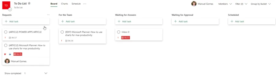
It's not a real planner, but it will give you my tasks for the next 2 days. For your reference, I'm writing this article 25th April.
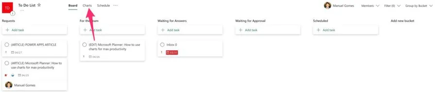
Now let's look at the Charts. To do that:
And you'll get this wonderful view:
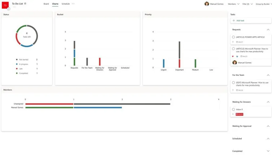
Here you can see a lot, so let's break things into sections:
Status
The status is an overview of your tasks and their status.
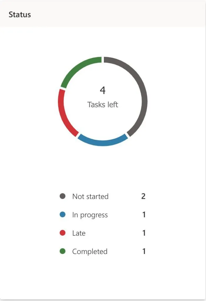
It's super useful to know what step the tasks are at and areas that need some attention. For example, the "Late" tasks jump as the first one to look at. I use this a lot, especially when I have more than one task, "In progress," meaning that I'm not as focused as I should be on finishing tasks.
Bucket
Depending on how you organize your buckets, you can take a lot from this section. For example, if you have late tasks that are "Waiting for feedback," it's probably time to give the person a call.
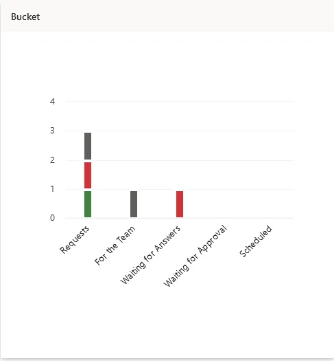
Also, you can wait to have 4-5 tasks in "Waiting for Approval" before you stop and go over them in a batch. It saves you time, and it's much more efficient this way.
Finally, you can see the "backlog" of tasks. Since Microsoft Planner segments the information, you can see what tasks are "In Progress" or "Completed" so that you know how many you still need to take a look at or move to other buckets.
The organization of the buckets is 100% up to you so you can call them whatever you want. Adapt them to your workflow but keep in mind also how they will show up in the graphs so that they can help you make decisions.
Priority
Going back to the Eisenhower Matrix, can you see the pattern here?
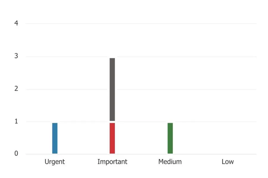
First, how to read it (how I read it), from left to right, I see quadrants one to four. So:
- Urgent is "Important and Urgent"
- Important is "Important and Not Urgent"
- Medium is "Not Important and Urgent"
- Low is "Not Important and Not Urgent"
Easy to look at and to identify what tasks you should do first. More things to keep in mind:
- Red means that a task is overdue. Depending on the quadrant, you should look at it first or ask someone for help.
- If you have a lot of tasks in the first and second one and none on the third and fourth, it means that either you're a master at saying no or you're not classifying the tasks correctly. Usually the latter, so review tasks and don't be scared to put them in low priority.
- All of these are guidelines. If you have to change the order or do tasks that are not important, that's fine. But use this to your advantage and especially use it to show other people that you're too busy to accept a 3 or 4 quadrant task. Don't tell them it's a 3 or 4, of course :).
Members
Depending on your position, this one can be useful for:
- If you're a manager to understand which people have more tasks.
- If you're a team member to try to help other people with many tasks to their name.
Tasks should not be "Unassigned." Someone should be responsible, even if it's to understand the priority and give a deadline. If you have a team of people and there's an "Unassigned" task, everyone will play the game "Not it" or think "Jack will do it for sure" while Jack will think "that one is not for me."
Final Thoughts
We used the Eisenhower Matrix to keep things simple and to prove a point. You don't need complex strategies to be productive. Notice that with simple charts and columns we could get a lot of information. The team, at a glance, can look at what's important and tackle it.
It's all about strategy, not tools. Tools help, strategy wins.
Photo by Markus Spiske on Unsplash


No comments yet
Be the first to share your thoughts on this article!