Power Apps enables us to build very complex layouts but having them look good is hard. Not only looking good but looking symmetrical. Even if it’s a few pixels off, people will notice, even if you don’t, when building the layout of your elements. So we need a way to auto-layout the elements in a Power App.
When you “eyeball” the position of a UI element, we call it “magic numbers.” The X and Y are not calculated, and they are a certain number because it “looks good” on the canvas. There’s a better way so let’s explore it.
Don’t worry too much about the math. Try to understand the steps, and you’ll see that all “makes sense.” After you get used to doing things this way, you’ll never define your UI with numbers ever again.
Auto layout is a concept that you can take with you to other tools and programming languages. Some tools support it, but if not, simple math and a good strategy will take you a long way.
3 column layout
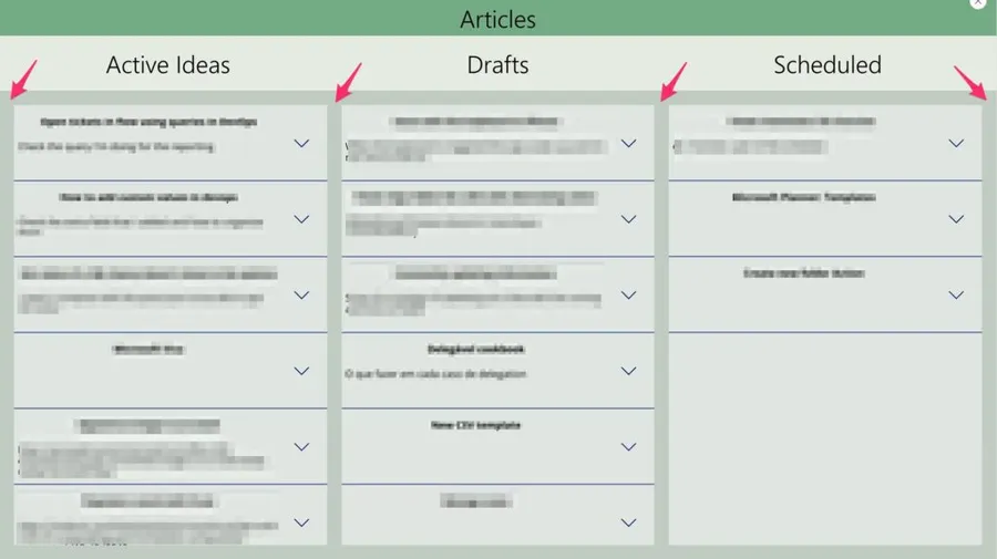
I’m building a new article manager for my ideas (this is a work in progress 😀), so I want to have the list of active ideas, my drafts, and the stuff I have already scheduled to publish.
Here’s what it looks like:
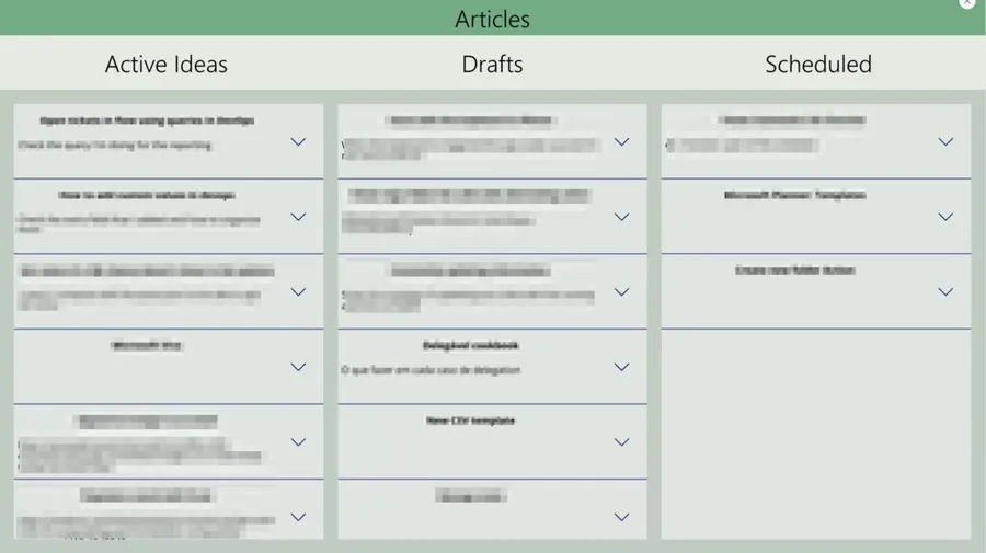
Sorry for the blurring but no spoilers!
As you can see, I have the 3 galleries of the same size, evenly distributed, and with the same margin from each other and the top and bottom. If you want to position this by dragging, it would be a pain, and it would never look good. And if you decided that you needed to make the window a bit bigger or smaller, you needed to do it all over again, so the concept of auto-layout applies perfectly here.
Have a reference
The idea is to have one element in your UI that serves as a reference so that we can auto-layout all the other elements. It could be the canvas size or any other, but in my case, I chose the rectangle for the title. Why? Because when I decide to have a menu on the size, I’ll resize only that one, and all the UI will adjust.
Here’s my reference:
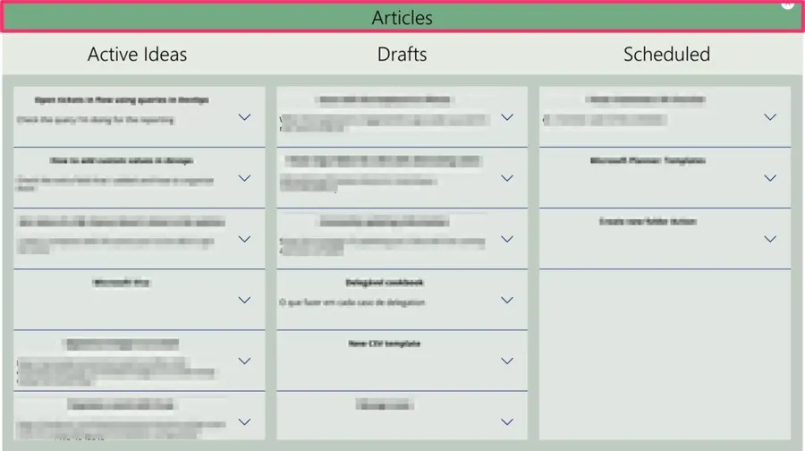
This serves several purposes:
- It will define the width of my content.
- It will define the height of my “sub-menus.”
Have global variables
It’s also important to have variables that control the overall UI. Imagine that you have multiple sections that share some aspects of the UI, like the distance between objects. If you define that value in a global variable, you’ll be able to re-use it on all your screens. Also, if you decide that you want a bit more, you only have one place to change, and the whole app auto-layout or will change at the same time all the elements that refer to that one.
In our case we’ll define 2 variables:
- varSpaceBetweenLists
- varNumberLists
I call them “lists” to be generic. Again you can use these values in any UI type, so I didn’t want to restrict them to “gallery items.”
To define them, you only need to do:
Set(varSpaceBetweenLists,20); Set(varNumberLists,3)
The title
Let’s start with the easiest one. The “Sub Title Bar.” I want this one to be a bit bigger than the title bar so that the titles “pop” (I’m not a designer, so apologies if I’m offending someone that actually knows how to design things).
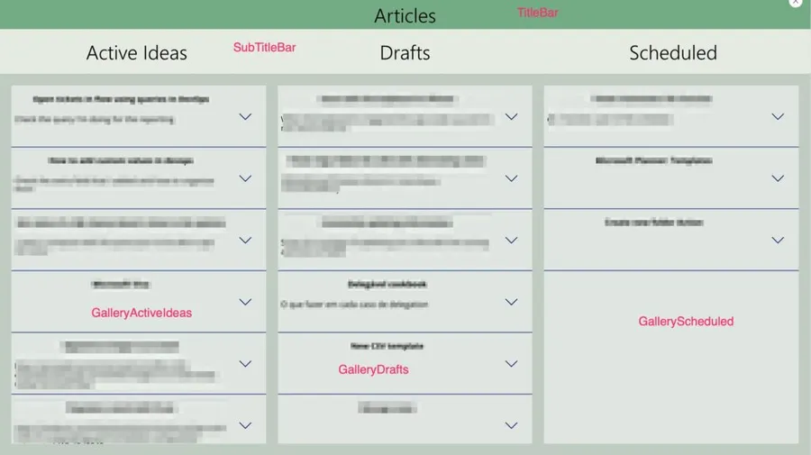
I’ll define it like 50% bigger than the title bar. I can calculate and say that the previous one is 50, so this one should be 75, but again we want everything to be “in the reference” to another element. So I’ll define the “Height” as:
TitleBar.Height + (TitleBar.Height * 0.5)
I prefer to use multiplications than percentages, but you can also use % to get the same value.
If I increase or decrease the size of the TitleBar, the SubTitleBar will adjust automatically. No action is required, so we’re on our way to having a nice auto-layout of our elements.
The Galleries
Now let’s look at the galleries.
Y Position
Let’s start with the Y position (the distance from the top). All of them will be placed at the same position, so the formula is the same for all 3. The position will be the height of the title and sub-title plus the distance between elements. So we’ll have in the “Y” properly.
TitleBar.Height+SubTitleBar.Height+varSpaceBetweenLists
So we’re positioning by adding all the elements that are “above” them plus the defined space.
Height Position
The height position follows the same mindset as before. We want to have the full height of the Screen minus all the elements and all the spaces.
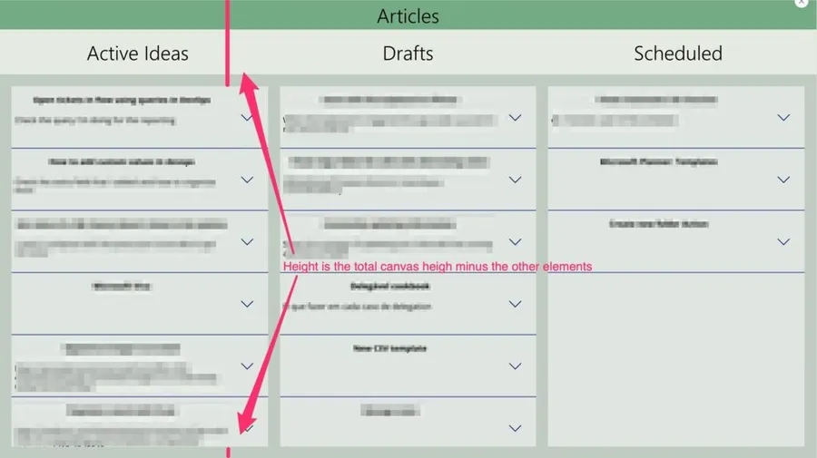
So we need to put in the “Height” property of the object:
ArticleManagerScreen.Height-TitleBar.Height-SubTitleBar.Height-(varSpaceBetweenLists*2)
This is the same for all the galleries since all of them will have the same height.
X Position
The X position (distance from the left of the screen) follows the same strategy as before. We want to position it for each element by adding the spaces and Width of all elements that come before. So for the first one, we only need to add the space in the “X” property.
varSpaceBetweenLists
For the second, we need 2 spaces plus the width of the first gallery:
GalleryDrafts.Width+(varSpaceBetweenLists*2)
For the third one, we need 3 spaces plus the width of both galleries:
GalleryActiveIdeas.Width+GalleryDrafts.Width +(varSpaceBetweenLists*3)
So we keep positioning it further away from the left border.
Width Position
This is the most tricky one but let’s go over it slowly.
For this, we need to divide the galleries between the available space. The available space is the Screen’s width minus all the spaces that we need between each gallery.
To calculate the spaces that we need is simple. If we have 3 columns, we need 4 spaces.
So we need the “varNumberLists” + 1.
The overall mindset is. The width of each element is the space left from all the other elements and spaces.
How to calculate the width of each gallery? Let’s make a simulation in Excel:

So we have 4 spaces and 3 lists. We want to get the total width from our reference and divide it by the number of lists:
(TitleBar.Width / varNumberLists)
After that, we want to remove the number of spaces by “dividing” the spaces between the number of lists.
(varNumberLists+1)/varNumberLists)
Now we need to multiply by the actual space so that we can get the overall space left, and we’ll get:
(varSpaceBetweenLists*((varNumberLists+1)/varNumberLists))
Putting all together:
(TitleBar.Width / varNumberLists)-(varSpaceBetweenLists*((varNumberLists+1)/varNumberLists))
I know it looks complex but let’s recapitulate:
- If we have a space of 300 and have 3 lists, we will get 100 for each one.
- If we put 100 in each, they won’t have spaces, so let’s add them
- We need 4 spaces for 3 lists.
- Each space is defined in the variable, so we need to know how much we can reduce in each gallery to get the correct spacing.
- If we have 3 lists, we need to remove the spaces for 3 lists, not 4, so we need to calculate the 4/3 of all the spaces.
- Get all those calculations and add them to the “Width.”
I know it looks complex but read it step by step, and I’m sure you’ll get it.
Resize your reference element and see what happens. Your UI will completely resize itself, and it will look good—the same with the lists. If you remove one and change the variable from 3 to 2, you’ll get the perfect spaces with the perfect width. So we get the auto-layout of the elements because the properties are all calculated based on each other.
It’s worth the extra step of doing the math. Any changes that your stakeholders ask you can be done in seconds and not hours (if your layout everything by hand).
Final thoughts
As you noticed, the concept of auto-layout is achieved by us doing the "math" in each element. In the end, it’s all about strategy and saving you time.
The math can be tricky, so accept some recommendations:
- Start with excel as I did above. Do the spaces and add a random width.
- Do the formulas and see if the math “works out.”
- With the final formulas, build your X, Y, Width, and Height
Having a nice-looking UI is super important, and with this, you’ll always have an auto-layout of your elements if you do a bit extra work.
Photo by Daniel McCullough on Unsplash



Just use containers...