
When you publish your Power App, you should be aware that Power Apps are also available for mobile. This is easy to overlook, but having the power (no pun intended) of Power Apps in your pocket is fantastic.
Let's look at some examples, and for that, we'll look at the Power Apps template gallery. Check it out because it's a fantastic resource for having something that you may need already done or to learn how you can implement something. To access them, go to make.powerapps.com and pick the following template page:
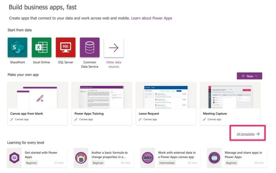
A quick note before we start. Microsoft has moved things around since I first wrote this. The templates now live under "Create" in the left navigation, and Microsoft's own documentation no longer walks you through starting from a template at all. It points you at a blank canvas, at Copilot, or at your data instead. The templates are still there and still worth your time, but the menu you see may not match my screenshots, and Microsoft has quietly retired individual templates over the years without announcing it. So if one of the ones I mention below isn't in your gallery anymore, that's why. Pick a neighbour and follow along.
You'll find a bunch, but let's pick one or two to see how they behave on mobile.
Examples
I'm going to pick simple examples of apps that exist everywhere in all shapes and sizes, but still, people don't find the app that solves all their problems. I'm talking about expense management and To-do lists. I can bet that you already tried a bunch of these apps, and none made sense for you or had the features that you need. Let's look at the samples from Microsoft and see what we get.
Mobile Expenses
Let's pick the mobile template expenses. I think that for some of you, not many changes would be needed for this app to be useful.
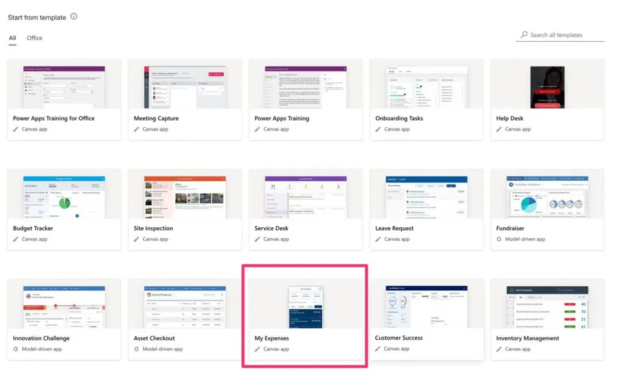
Here's what it looks like on the browser:
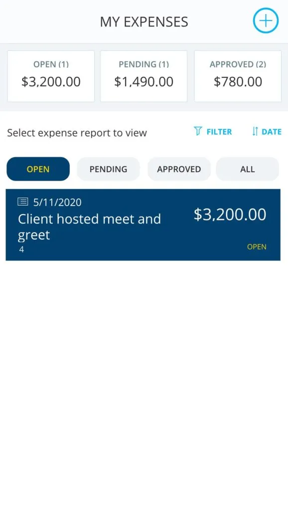
Navigating is also amazing:
Linked, not embedded. This page does not load YouTube, so it cannot track you here.
Not bad, but let's watch it running on the phone.
Linked, not embedded. This page does not load YouTube, so it cannot track you here.
Ok, not so spectacular as on the browser but still runs. If you notice it doesn't cover up and down the full screen, has some lines trimmed and, when you pick an option, it scales for some reason. Hold that thought, because there's a good reason for it and we'll get to it in a moment.
But it's a fantastic start since we only pushed four buttons until now.
To-do List
When I first wrote this, the To-do template connected to Wunderlist, and I said it needed updating because Wunderlist was going away soon. It did. Microsoft shut Wunderlist down on the 6th of May 2020, and the connector reference isn't even on Microsoft Learn anymore. So the template as it stood is history, and if you find a copy of it somewhere, it won't work.
The idea behind it still holds, though, and it's a great example of how to have a view on another app. Let's say that you have an app that you like but wanted it to work differently. Why not build a Power App on top of its API and fill in the gaps?
Here's how it looks on the browser:
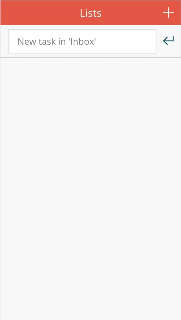
If you want to build this today, the connector you're after is "Microsoft To-Do (Business)". It's a standard connector, so it won't cost you anything extra, and it does the same job Wunderlist used to do. Even with the old template dead, look at what it already gives you:
- A nice layout
- Add button
- Form to add lists and to-dos
We won't go any further, but I have a challenge for you below.
Bonus: Helpdesk App
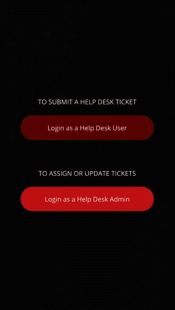
Want a Helpdesk app right out of the box with no setup? There's a template you can pick that delivers this:
Segmentation for admins or users
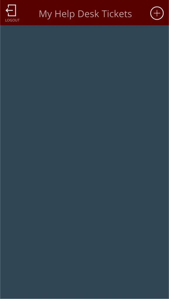
List of submitted items.
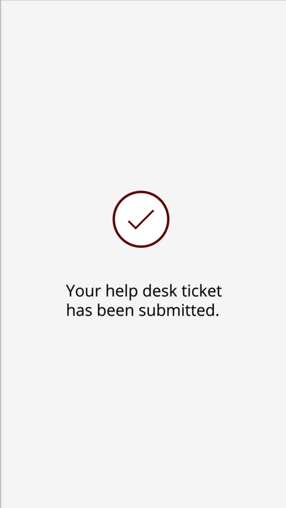
New item

Submitted screen
List of items refreshed.
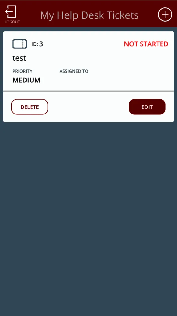
All of this with no configuration needed and works directly with your Office 365 accounts, meaning that you can assign people belonging to your organization and get details for each of them.
Why it looked wrong on the phone
Remember the video where the expenses app didn't quite fill the screen and everything scaled oddly when we picked an option? That's not the template being sloppy. It's a setting, and it's on by default.
The setting is called "Scale to fit", and you'll find it under Settings, then Display. When it's on, your app is designed for one fixed canvas shape, and whatever screen it lands on, the whole layout is simply scaled up or down to fit. It doesn't reflow. It doesn't give you more room. It just gets bigger or smaller, which is exactly the letterboxing and trimming we saw. "Lock aspect ratio" travels with it.
The fix is to turn "Scale to fit" off, and then stop dragging controls around to position them. Instead, you size and place things with formulas that refer to their parent:
Width: Parent.Width
Height: Parent.Height * 0.5
Inside a gallery, you use "Parent.TemplateWidth" and "Parent.TemplateHeight" instead. Better still, drop your controls into layout containers and let the container do the positioning for you.
Two things worth knowing here. First, if you drag a control or resize it by its border, Power Apps overwrites your formula with a hard-coded number, and you're back where you started. Second, the authoring canvas doesn't honour your sizing formulas, so you genuinely have to save, publish, and open the app on a real device to see what you built.
If you're starting fresh, the easiest win of all is to pick "Responsive" instead of "Phone size" in the blank app dialog. And while you're in Settings, turn on modern controls under Settings, then Updates. They're the Fluent 2 controls Microsoft now recommends, and they look and behave much better on a phone than the classic ones.
Non-intuitive behaviors
Mobile has a few surprises that catch people out. None of them are hard to work around once you know they exist, but they're the kind of thing that costs you an afternoon if you don't.
Deep links now need the environment ID
Since the 1st of May 2026, every deep link into a canvas app on Power Apps mobile has to include the environment ID. Links built the old way stopped working, and that includes home-screen shortcuts your users may have pinned months ago.
If you shared a link to your app with your team and it suddenly stopped opening, this is almost certainly why. You'll need to generate new links and ask people to recreate their shortcuts.
The app won't show up until it's shared with you
If you didn't create the app, it only appears on the phone once it's been shared with you. Even then, the first time you have to go to the "Apps" screen and search for it by name. Open it once, and from then on it sits on your Home screen like you'd expect.
Newly published apps lag behind
Publish a change and the mobile app may not pick it up straight away. The trick is to open the app on the device while you're online and leave it open for a minute or two. App metadata also caches for a full day, so a stubborn app may need a proper close and reopen.
SharePoint attachments don't download on mobile
This one is genuinely annoying. Power Apps doesn't support authenticated URLs, and SharePoint attachments are exactly that. It works fine in the browser, because your browser is already signed in, so you'll swear the app is fine right up until someone opens it on their phone.
Offline is Dataverse only
Canvas apps can now work offline with a single toggle, under Settings, then General, then "Can be used offline". It's a lovely feature. It also only works with Dataverse. SharePoint and the other connectors are not supported offline, so if you built your app on a SharePoint list and you were counting on offline, you'll need to rethink where the data lives.
Sources: Run canvas apps on mobile, Important changes and deprecations, and Offline limitations on Microsoft Learn.
What it costs, and how far you can take it
I said in the original version of this article that it costs little to nothing to run, and that's still broadly true, but it's worth being precise about where the line sits.
The Power Apps licence that comes with Microsoft 365 covers you for running apps in the browser and in the Power Apps mobile app on iOS and Android, using standard connectors, and even running canvas apps offline. That's a lot for no extra money. What it doesn't cover is premium connectors, custom connectors, and on-premises data. For those you need Power Apps Premium, which is 20 dollars per user per month. The old per-app plan is on its way out, by the way. Microsoft stopped selling it to new customers on the 2nd of January 2026.
If you want to go further than the Power Apps mobile app, there's something called "wrap". It packages your canvas app into a proper signed iOS or Android app, with your own icon, your own splash screen, and your own colours, which you can then push out through the app stores or through Intune. Your users install it like any other app and never see Power Apps branding at all. It didn't exist when I first wrote this, and it's the answer to the question I always used to get: "yes, but can I ship it as a real app?"
A challenge
You've seen where we get with templates, but I want to issue a challenge for you. Pick one of the items and make it yours. Adapt it to your needs and start using it. You'll see with little effort you can have the to-do list of your dreams, or a fully functional Helpdesk mobile tool that you can propagate to your organization quickly, or a place to submit your expenses.
If you need help, let me know, and I'll do my best to help you, but the point is this. Use the templates and start exploring. You'll gain a skill that is quite handy. Using Power Apps to build quickly things that either don't exist, are too expensive or don't fit the needs.
Final Thoughts
I know what you're thinking. There's no code, and you're explaining and using Microsoft's templates to have an article. Yes, indeed I'm using them, but the point of this article is to convince you that:
- If something doesn't exist, make it.
- There are templates with a lot of work done for you.
- The integrations with other parts and tools of the organization are quite easy also.
- It costs little to nothing to have it running.
- It works automatically on all the main browsers and mobile (iOS and Android), so you're deploying something quickly to multiple platforms.
I'm using the mobile part as an example to show the full spectrum that you can reach, but the concept stands for desktop apps.
The one thing I'd add now, with a few more years of looking at this, is that a template getting you 80% of the way there is only useful if you know how to close the last 20%. Turning off "Scale to fit" and learning to lay things out with containers is most of that gap, and it's a good afternoon's investment.
So please explore and share your findings. I'm curious to see what you've built and if you have any issues, let me know. I'm more than happy to help you create the next great app that will make you and your team much more productive.
Photo by Marjan Grabowski on Unsplash



No comments yet
Be the first to share your thoughts on this article!